Sometime
A better way to remember recurring tasks
My roles: Product design, user testing, iOS development, and product marketing
Timeline: 4 months in 2019
Sometime is an iOS app my brother and I created to let people keep up with the many recurring tasks in their daily lives. The idea came from our struggle to remember the last time we've done certain tasks, such as getting haircuts, watering the plants, and running the dishwasher. We wanted to get gently reminded of these chores, so we can have a peace of mind.
In addition, I wanted to challenge myself in building a mobile app from concept to launch. Thus, I took on the role of a designer, developer, and marketer to experience the full development process.
The problem
People who have many recurring tasks related to their daily living can find it challenging to keep up with them. How might we help them easily stay on top of these tasks, so they can have a peace of mind?
Validating the problem
Although this is a problem we have, we wanted to know if other people may have it too. I looked up quotes from users of productivity apps on Reddit that aligned with some initial ideas we've had for Sometime.
I'm looking for a tool that reschedules a task based on when I completed it instead of when I first scheduled it.
I am trying to find a new way to handle everyday tasks (daily, weekly) and things you know you should be doing that require less frequent oversight (monthly, yearly).
I would like for these tasks to have no specific due dates, but to be managed in an ongoing cycle.
There were also mentions of similar apps, such as Due, Recurrence, and Regularly. These show that there is a market for managing recurring tasks beyond what a standard todo app can do.
Building the app iteratively
After establishing our goals, constraints, and design principles, the project went through the following milestones:
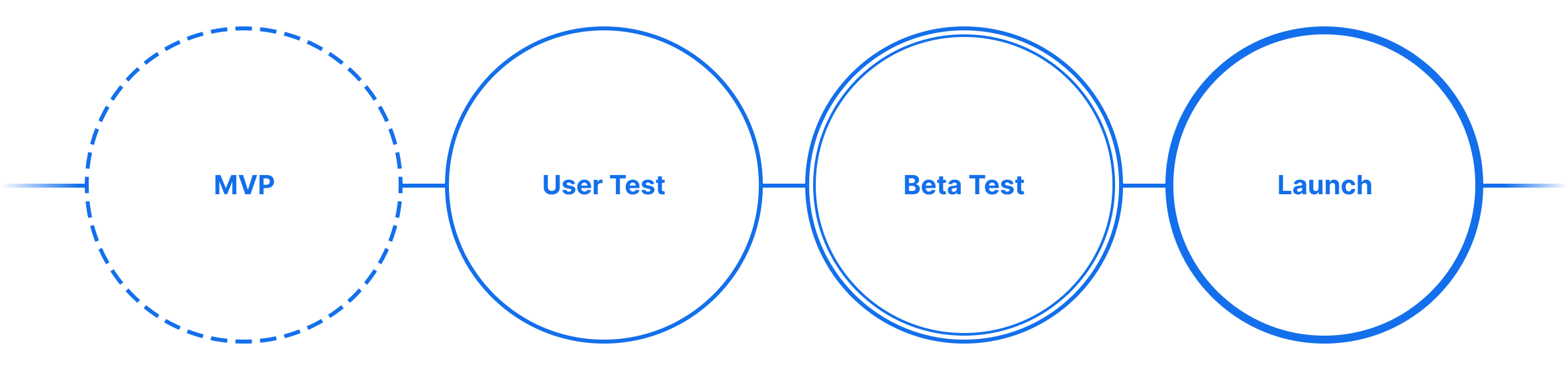
Minimum viable product
For the MVP, I created mock-ups of the app based on the user needs we've identified. My brother and I went through iterative reviews until the direction felt right. Then, I learned how to code in Swift, and we divided the work on building the iOS front end.
User testing
I planned and conducted 5 in-person usability tests using the MVP build on my iPhone. The results informed significant design changes for the beta.
Beta testing
To recruit participants for the beta, I posted a screener survey on Reddit. Within the first few days, we received 150 responses and invited most of them to use our TestFlight build. The feedback from a post-test survey prepared us for v1 of the app.
The rest of this case study will cover the key changes made to the user flow based on user feedback.
Task creation
Job story: I need to easily create a task with recurring reminders.
One of the primary actions the user takes in the app is to create a task. I wanted the UI to be like a mad lib, so the user thinks about what they want to track rather than just feeding in their inputs.
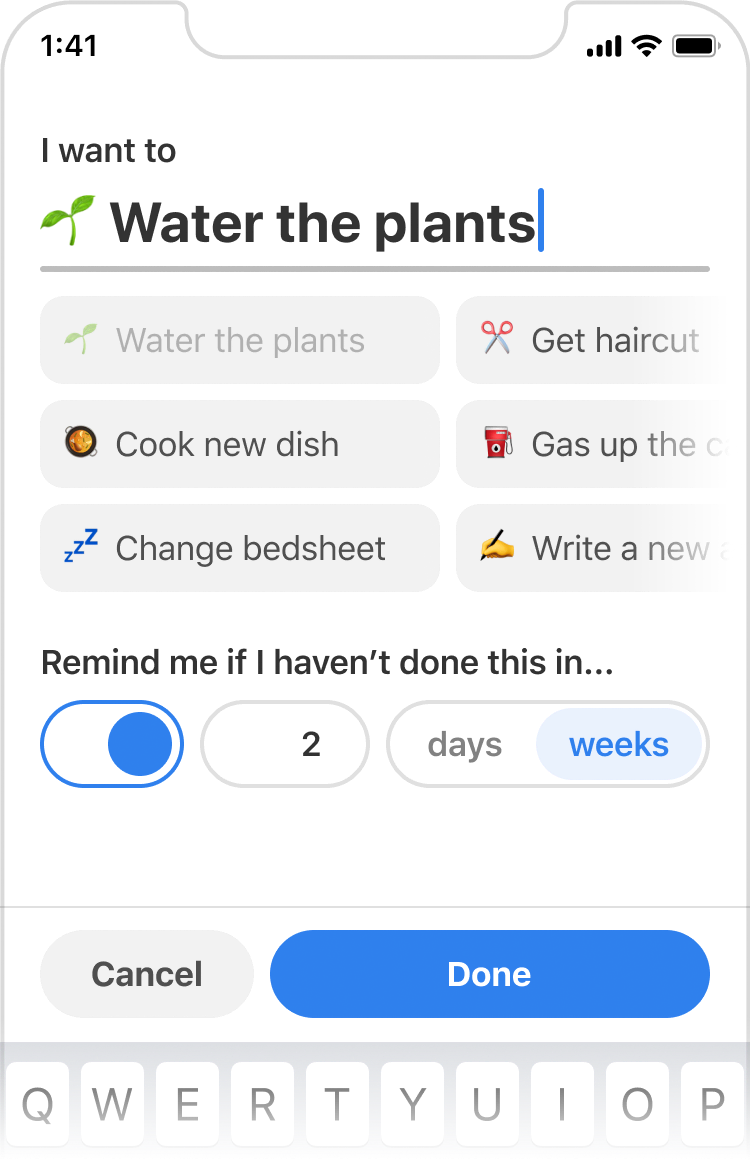
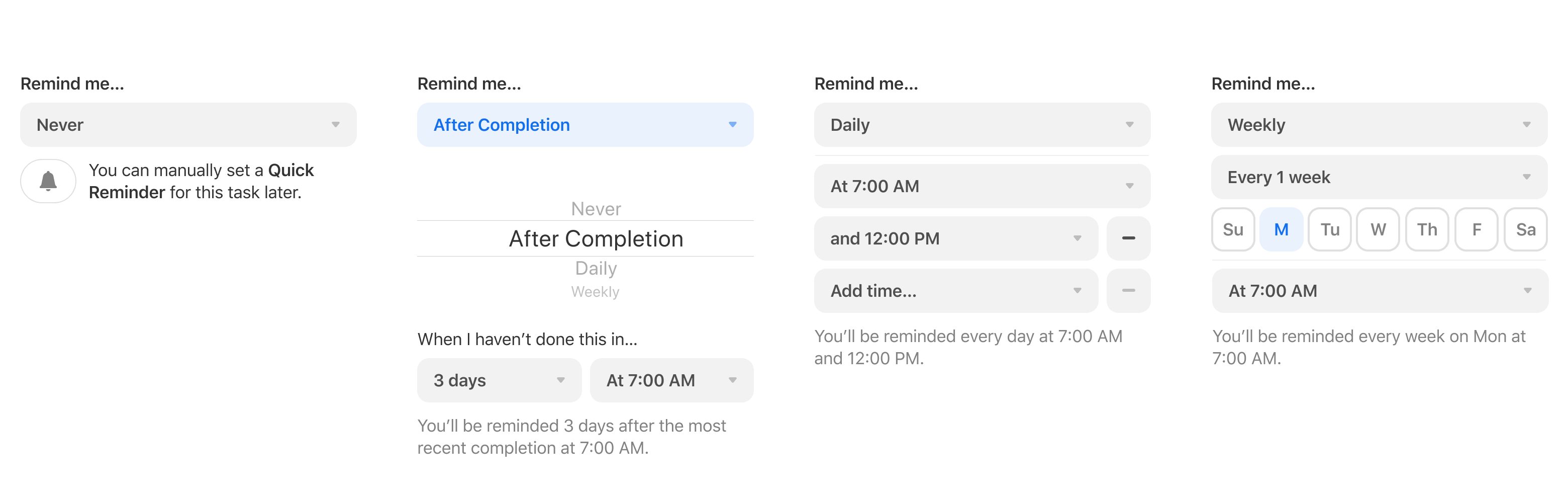
Later, I added a way to set reminders at a daily or weekly interval. A segmented control lets the user easily switch between this and the relative reminder option.
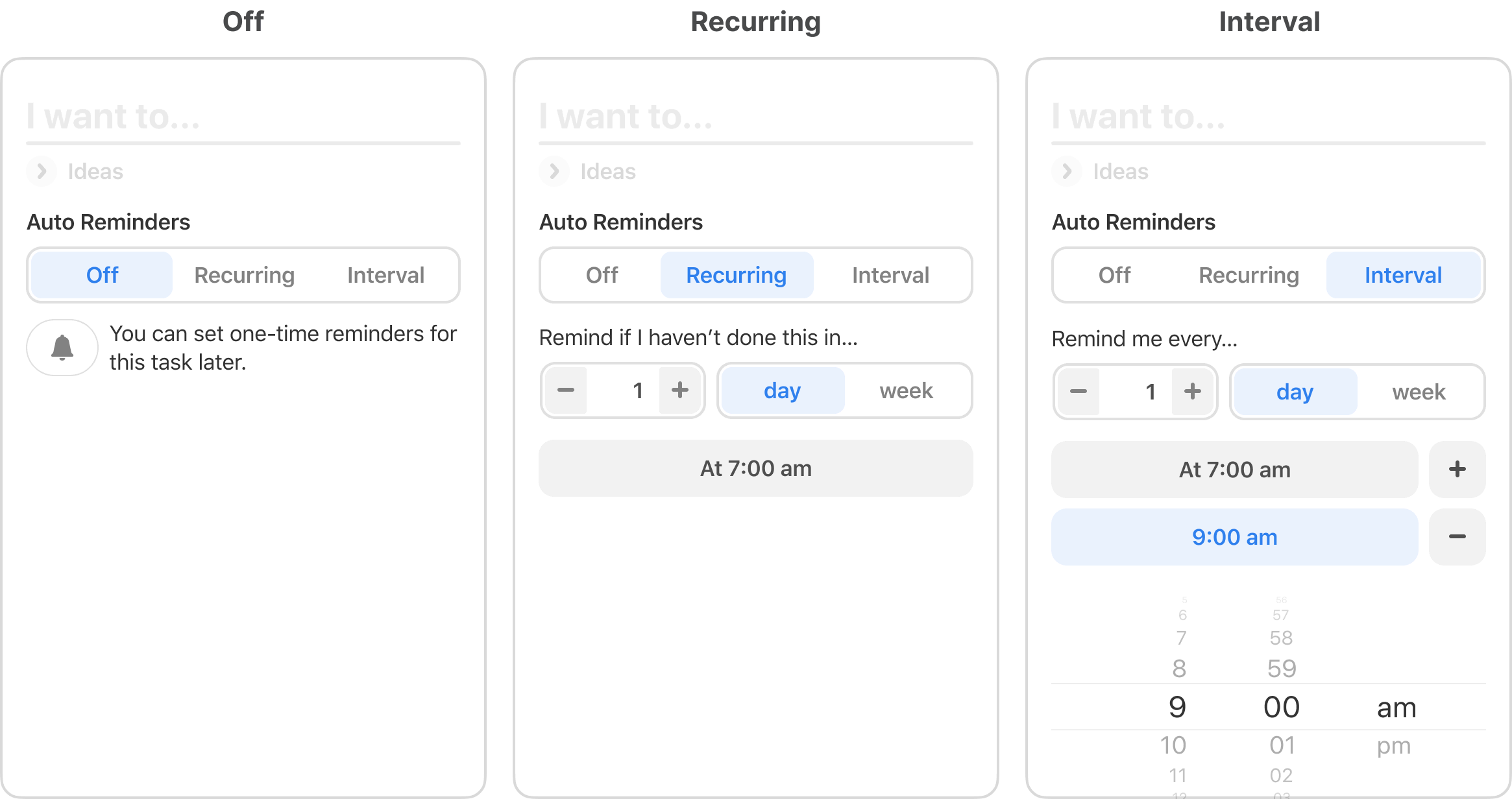
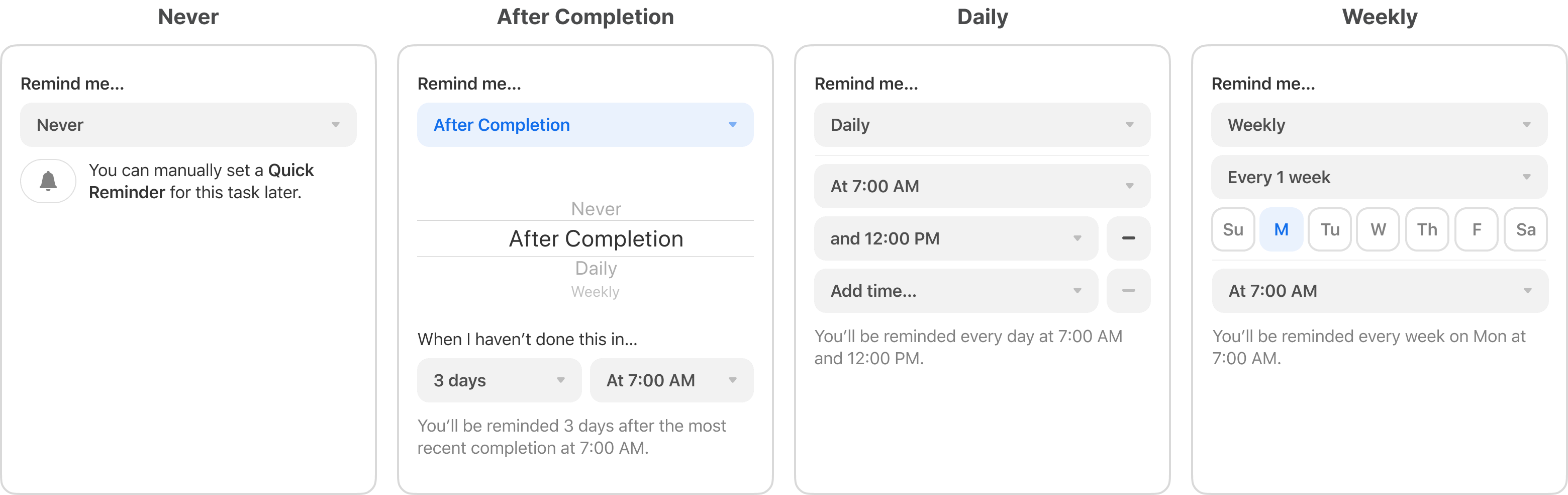
However, people were confused by “recurring” vs. “interval” during the user test. I struggled with this for a while and eventually settled on a “remind me…” label, followed by a picker input for the reminder type. For example, “remind me daily at 7:00 AM” read better than “auto reminders, interval, remind me every 1 day at 7:00 AM”.
In addition, I added a summary text at the end of the form to let the user confirm their inputs.
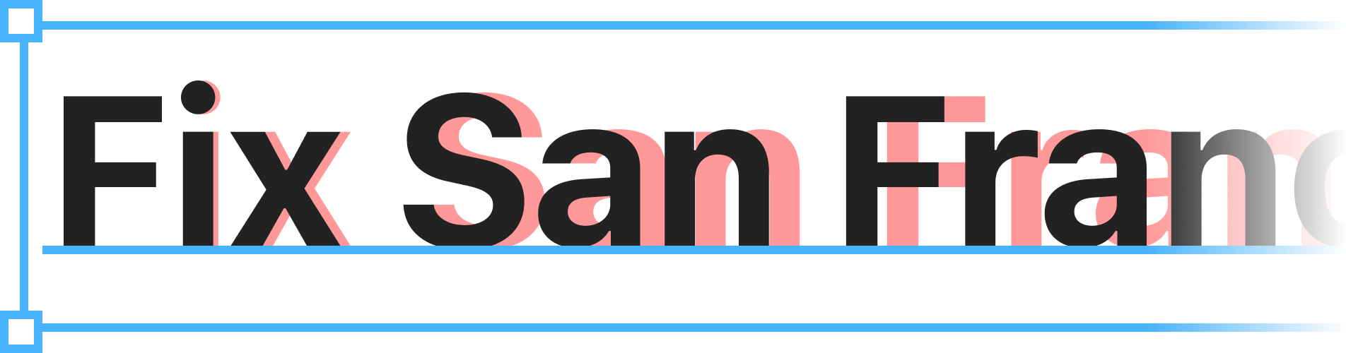
Aside: When Figma first launched plugin support, I developed Fix San Francisco. It automates the correction of tracking and fonts for texts using Apple’s SF typeface. The plugin allowed me to create iOS mocks more accurately and over 11,200 designers (as of Feb 2024) has used it.
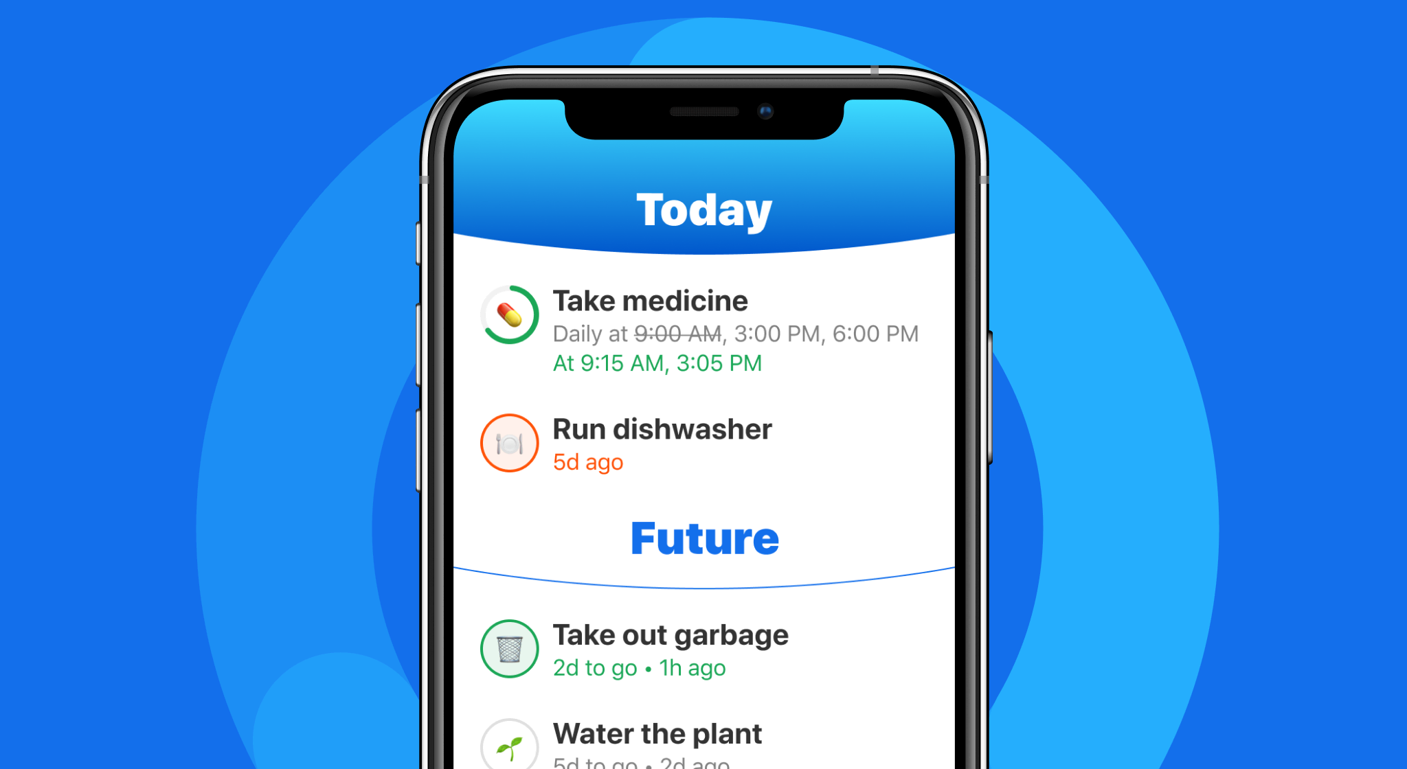
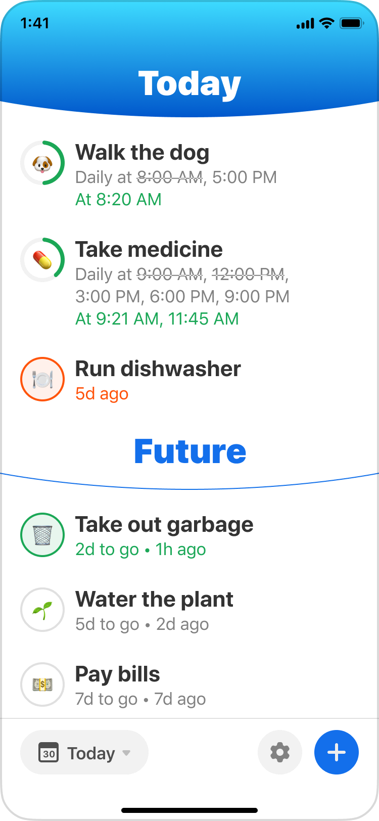
Home
Job story: I need to know what tasks I need to do next at a glance.
In an earlier design, I played with Apple’s activity rings to convey the time until the next reminder. However, the mechanism was hard to grasp because each progress ring represents their own reminder duration, so we scrapped this idea.
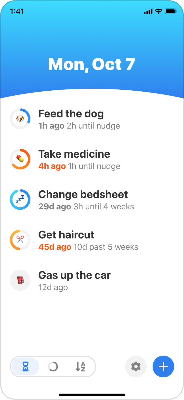
I changed the ring around the task icon to represent the task status instead. Green indicates the task is completed for today, and orange indicates it is overdue. Fortunately, this design was well-received by our beta testers.
In addition, participants mentioned they’d like to see tasks that mattered today upfront. Therefore, I grouped them into Today and Future.
Task history
Job story: I want to know when was the last time I completed a task and how often I've completed it, so I can understand my habits.
In the first version, this screen showed a timeline of completions and the time intervals between them. However, it didn't give a sense of how much time is between each completion.
My brother proposed showing intervals as progress bars like the ones from MacRumors Buyer’s Guide. So, I experimented with the idea and overhauled the screen with better visualizations. I also added a “quick reminder” and an “auto reminders” button to help people distinguish the two functions. These changes made the screen easier to understand.
Onboarding
Goal: Help people understand the value of the app and its core concepts for the first time.
Given the straight-forward purpose of the app, I designed the onboarding to be hands-on by getting the user to create a task and learn about app-specific shortcuts. I also wrote the copy to be concise and casual so people can feel that the app has a friendly persona.
Launch
In preparation for the release, I wrote the marketing copy and created a landing page. We promoted the app through ProductHunt, Reddit, and our mailing list.
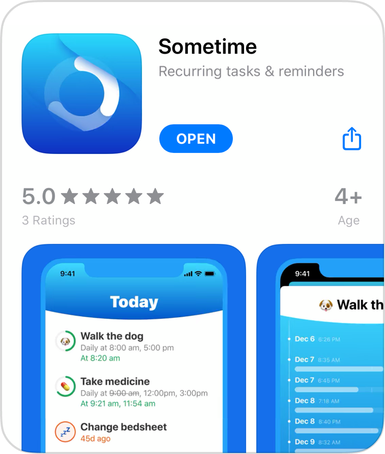
On launch day, we had 61.58% conversion rate across our channels, and people have downloaded Sometime over 200 times. Moreover, the app had a positive reception from our users.
I tried many to-do and task tracking apps but it felt rather like a chore to use them. This one on the other hand is somewhat inviting and fun to use due to it’s simplicity and nice design.
This app was written for me; I have not had any questions whether I took my medication or not since installing it.
Just wanted to send a note - love your app, it was totally the missing piece in my workflow.
Just downloaded the app, really like the UX design. It's refreshing to see non-standard iOS UI :D
After a month, the app has garnered a 4.6/5 average rating and was downloaded over 9000 times worldwide.
Reflection
On usability testing: For the MVP, I tested with people I knew to keep costs minimal. However, some of my participants were not quite in my target audience. If I had the resources, I would have put more effort into screening to get better quality feedback.
On perfection: I spent a lot of time coding and fixing the UI because I wanted to realize my vision. However, I learned that getting feedback early and often was more valuable because it guided me toward simpler implementations. Overall, despite the grind, I was happy with the project because I’ve gained new confidence in delivering a product from scratch.
Takeaways
- Designed, coded and shipped Sometime, an iOS app for recurring tasks and reminders.
- Planned and conducted usability and beta testing to inform product and design decisions.
- Developed and released a Figma plugin used by designers to create more accurate iOS mocks.
Other projects
- Clio MobileEmpowering legal professionals on the go
- Clio for ClientsSecure and accessible legal communications for all